The brief for the first assignment was to capture eight pairs of contrasting images from a larger list of paired contrasts, along with a final image that conveys a pair of contrasts in the one frame.
I’d recognised the moment I read the brief that it was
intended to be a culmination of the learning I’d gathered during the exercises
to date (rather than an exercise itself).
By that I mean that I was conscious of how the focal length, depth of
field, crop, horizontal vs. vertical frame etc. could accentuate the impression
my images were to give the viewer. It
wouldn’t be enough, for example, to find something curved and capture it.
I felt that it was important for each pair of images to connect
to each other, which is why you’ll see contrasting pairs where both include
people, or buildings, or modes of transport etc.
I’ve also opted for a cohesive theme – Manchester. I believe the end results demonstrate that
this was a worthwhile approach as opposed sixteen unrelated images.
All post production work was carried out in Adobe Lightroom
3 unless otherwise stated.
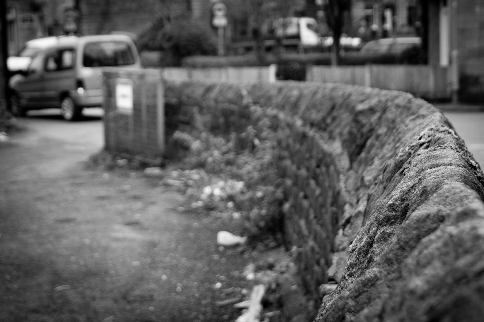
Diagonal/Rounded
The bright yellow arm of the larger crane dominates the
frame (and I’ve emphasised this further by increasing levels of yellow in post
production). A vertical frame enables a longer diagonal than a horizontal frame
would have.
Diagonal/Rounded
 |
| 200mm, 1/200 secs, f/13, ISO 400 |
Only upon closer inspection do you see that the frame is
actually comprised of many diagonals – the smaller red crane and the window
frames. Finally, in post production, I
altered the horizon ever so slightly to exaggerate the diagonals.
 |
10mm, 1/1600 secs, f/4, ISO 400
|
Having spotted the possibility of using the spiral entrance
to a multi-storey car park, and keen to find an unfamiliar perspective, I
headed to the top level and shot downwards.
My first couple of attempts didn’t include the vehicles and as a result
lacked a little something. The final
image, with the three cars in shot, is more dynamic because of its sense of
movement.
Wishing to fill the entire frame a used a horizontal
composition and increased levels of yellow.
This helps to move the viewer from the left hand side of the image down
the spiral.
High/Low
 |
| 18mm, 1/100 secs, f/16, ISO 200 |
Choosing an appropriate viewing angle was the first
decision, and standing at the foot of the building proved most effective. Alternative perspectives brought other
buildings into the frame that minimised the appearance of height.
I’ve used a wide angle to accentuate the height of the
building and chosen a large aperture to keep all of the building in focus. The diagonal composition, along with the
architectural features, draws the viewer along the length of the building.
Finally, a narrower crop in post production gives an even
greater sense of height.
 |
| 20mm, 1/60 secs, f/5.6, ISO 200 |
This cobbled street in Manchester’s Northern Quarter is in
contrast to the surrounding roads.
Shooting extremely low gives the viewer an alternative perspective – even
if the scene is familiar to some.
By selecting a narrow depth of field I’ve emphasised the
lowest element of the scene (i.e. the foreground). A wide angle, horizontal composition enabled
me to fit more in the frame.
In post production I increased the saturation levels
slightly to bring out the bright colours of the yellow lines and the graffiti
scene.
Curved/Straight
 |
40mm, 1/80 secs, f/13, ISO 400
|
Clearly it’s the tram tracks that provide the curved element
to this scene. However, an absence of a
tram caused two problems. The curved tracks didn’t sufficiently dominate the
scene (the people and the bright shop fronts did) and they lacked clear
direction (were they running front to back or vice versa?).
The inclusion of a (predominantly straight) tram gives a
greater sense of context and curve to the image. Notably its inclusion brings direction and
solves the tension of which way the tracks are running.
In post production I’ve increased saturation and added a
vignette to draw the viewer to the tram in the first instance. The viewer’s eye
then follows the curvature of the tracks out of the frame in the bottom left.
 |
| 70mm, 1/100 secs, f/14, ISO 200 |
My first couple of attempts were taken at street level. This resulted in the lines of the road
converging into a triangle; and more fitting of the diagonal brief. Instead, I headed for higher ground where I
could use a longer focal length to prevent the road lines converging; keeping
the scene straight.
This straightness is accentuated by the addition of vehicles
all heading in the same direction as the viewer’s eye and the fact it’s flanked
by the straight facades of the buildings on either side.
Vertically framed, I’ve added a graduated filter along both
sides to ‘narrow’ the image and highlight the road further.
Few/Many
 |
75mm, 1/125 secs, f/9, ISO 400
|
This is a tour party outside of Manchester’s town hall. The
strongest component of this image is its composition. Leaving plenty of space around the group has
an isolating effect and makes it clear that they aren’t part of a larger group.
Converting the image to black and white removes any colour
distractions. In post production I’ve added a vignette to draw the viewer’s
attention to the tour party. I’ve also
made the Welcome to Manchester sign more prominent by selectively lowering the
brightness.
 |
70mm, 1/320 secs, f/2.8, ISO 100
|
I’ve filled the frame with the pigeons to give the
impression that there are many more outside the frame (which in fact there
weren’t). I’ve used a narrow depth of
field and focussed centrally, adding a vignette to keep the viewer’s eye away
from the edges.
In the black and white conversion the distraction of the dirt
and grime becomes texture.
Broad/Narrow
 |
10mm, 1/125 secs, f/13, ISO 200
|
In order to emphasise the breadth of the scene I chose a
horizontal frame to give greater distance between the left and tight sides of
the image. To accentuate the sense of
breadth even further I used a very wide focal length, just 10mm, and added a
graduated filter along the top and bottom (in post production) that has a
narrowing effect horizontally.
The composition is further strengthened by the bold
triangles of the green grass and blue sky.
 |
60mm, 1/50 secs, f/9, ISO 400
|
This is a strange Manchester backstreet that is barely wide
enough for vehicles to pass. The people
passing the scene not only provide an additional point of interest but also
bring a sense of scale. To prevent them
from dominating the frame I’ve chosen a slower shutter speed so as not to
render them static.
The scene lacked colour and therefore suited a black and
white conversion. I’ve also opted for a
narrow crop in order to create a claustrophobic feel. Graduated filters along the lengths of the
image narrow it further.
Blunt/Sharp
 |
10mm, 1/160 secs, f/5, ISO 200
|
This pebble is in complete contrast to a city full of
straight lines and right angles. A wide
angle not only emphasised its size and bluntness, but it also enabled me to
include the MCR sign in the background.
In post production I’ve cropped the image slightly to remove
a distracting lamp post leaning into the image on the extreme right hand side. I exposed for the background originally which
meant that I needed to selectively increase the exposure of the pebble too.
 |
| 30mm, 1/1000 secs, f/2.8, ISO 100 |
This image shares a similar shape to its counterpart. It’s very narrow depth of field emphasises
the sharpness of the barbed wire and a black and white conversion brings a certain
starkness or bleakness. It’s very
suppressive, in fact.
The curvature of the concentric circles is a strong addition
to the composition and leads the viewer from left to right. I’ve cropped the image slightly to eliminate
distractions to the right of the original.
Moving/Still
 |
40mm, 1/30 secs, f/8, ISO 100
|
Nothing says city more than a black cab and I’ve managed get
this one pin sharp with plenty of background blur (after only a couple of
attempts!). Composing the shot with the
cab to the left of shot accentuates the sense of movement towards the right of
the frame.
 |
| 24mm, 1/320 secs, f/2.8, ISO 100 |
The bicycle lock confirms that the subject is stationary –
but it’s the absence of its wheels that tells the viewer that its been there
for some time. Additionally, it’s in
contrast to the vehicles moving horizontally across the rear of the frame.
With a busy scene to the left, a vertical frame illuminated
the clutter and enabled me to include the building at the back of the
image. Adding a vignette isolates the
bicycle further.
Strong/Weak
 |
| 55mm, 1/500 secs, f/5, ISO 100 |
Choosing an angle beneath the statue is the primary means of
accentuating the strength of this powerful figure. The composition is made more dynamic due to
the figure leaning into the frame.
There was a very high dynamic range that blew out the
background. As I shot in RAW, I created
two exposures and used HDR software to merge them. The rich blue sky and, more importantly, the
fact that the statue is backlit add a further sense authority.
 |
| 150mm, 1/80 secs, f/5.6, ISO 100 |
This image is a contrast in itself. The primary subject – the homeless man – must
possess huge inner strength but it’s his physical frame that is weak. This is emphasised by his vacant eyes – he’s
in his own world as others pass by obliviously in theirs.
Opting for a slower shutter speed results in motion blur and
highlights the fact that the other people are merely passing through.
I’ve added a vignette to draw the eye to the centre of the
frame.
Dark/Light
 |
| 26mm, 1.3 secs, f/14, ISO 1600 |
A vertical frame mirrors the shape of the rectangular block
of light, which the viewer is drawn to because of the diagonal lines of the
bookshelves. A large depth of field
means the books are also in focus and enables the viewer to explore the scene
further.
The black and white conversion removes the colour
distraction of the books in the original images. Also in post production I adjust exposure and
brightness to help the viewer recognise the scene without it being immediately
obvious.