Tuesday 6 March 2012

Conclusions: Exercises eighteen, nineteen and twenty

I found this series of exercises surprisingly challenging to begin with as it took me a while to ‘tune in’ and deconstruct scenes and observe their component parts. The subsequent challenge was to then find and compose interesting images, which in the main I believe I have.

It’s fascinating the traits that each type of line brings to an image and I’ve noticed that since the exercise I can’t stop seeing lines within a scene!

The biggest lesson learned was that of selecting an appropriate orientation for the scene. Before the exercises I’d have assumed that shooting with the lines (e.g. shooting horizontals in landscape) would have accentuated the traits of the respective line types but the images of the multi-storey car park and the people at the bus stop go to show otherwise.

Saturday 3 March 2012

Exercise twenty: Curved lines


Curved lines, similar to diagonals, lead the viewer trough the image. However, curved lines are able to do so much more softly, slowly and with more grace. 
55mm, 1/100 secs, f/2.8, ISO 200
Although the scene includes a number of ovals, it's the curve of the orange slice that draws the viewer's attention, which in turn leads the eye to the out of focus hot drink. 
55mm, 1/160 secs, f/8, ISO 400
This scene naturally draws the eye from front to back along the wall. Unfortunately, the subject at the end of the wall isn't worth the wait. Instead I chose a narrow depth of field and focussed on the texture of the old stone wall at the front of the frame. I'm yet to decide whether breaking the norms of leading the viewer into the frame is effective. 
20mm, 1/200 secs, f/20, ISO 400
A stretched 'S' shape moves the viewer from front to back in this shot. It's made all the more appealing by the crest of the hill at the top of the frame - the viewer is unable to complete his/her journey. 
35mm, 1/250 secs, f/5, ISO 400
Just at the point when I was struggling to see any further curves I spotter this set of shopping trolleys. The series of curves overpower the appearance of a couple of parallel lines in the foreground.

Exercise nineteen: Diagonal lines

Diagonal lines can achieve a dynamic look and feel but diagonal lines aren't necessarily diagonal. A photographer's angle of view or perspective can result in straight lines appearing diagonal. I've captured a couple of examples of each. 
55mm, 1/200 secs, f/8, ISO 400
There are a number of diagonals in this shot but it's the 3 or 4 banks of chevrons. By only including the lower part of the car in the frame it doesn't detract from the diagonals - in fact, the opposite is true. 
80mm, 1/250 secs, f/4.5, ISO 400
The grave stones run in parallel to the road to the left and the church to the right but my angle of view results in 2 diagonals. The first (and strongest) is the base of each gravestone dismissing in size at nears the distance, and the second (less prominent) line formed by the tops of the gravestones.  
55mm, 1/400 secs, f/5.6, ISO 400
There are 3 main diagonals and a fourth created by the barrier in the back ground. Stood head on to the subject the line across the centre of the image was horizontal and reduced the power of the diagonals. Moving slightly to the right and tilting the camera a little remedied this. 
18mm, 1/30 secs, f/22, ISO 400
An obvious sense of perspective here as the parallel lines on the train tracks meet at the vanishing point on the horizon.  The was achieved with a low angle of view and a wide angle focal length.

Thursday 1 March 2012

Exercise eighteen: Horizontal and vertical lines

Horizontal and vertical lines each possess different qualities. Horizontal lines imply stability which can be in contrast to the strength and power that vertical lines bring to an image.

The brief was to find 4 examples of each.

Horizontal
50mm, 1/1600 secs, f/8, ISO 400
The horizontals of the zebra crossing form a foundation for the rest of the image, and even though there are as many verticals, it's the pattern of the bold horizontals that the eye is drawn to.

45mm, 1/100 secs, f/9, ISO 400
I captured a sequence of these images containing none to a dozen or so pigeons but having just 2 or 3 on the scene added interest yet didn't distract from the horizontals of the bench.  In fact, the horizontals of the bench draw out the horizontals of the sweet shop above - lines that you may otherwise fail to notice.

55mm, 1/50 secs, f/8, ISO 800
I like the sense of diminishing space that the two sets of horizontal lines imply (above and below) - seemingly squashing the car in the distance. A vertical frame accentuates this even further.

55mm, 1/125 secs, f/8, ISO 400
Both a vertical or horizontal frame resulted in 'dead' space, whereas this square crop works much better. This image also demonstrates how quickly the eye spots that the lines aren't level.

Vertical
55mm, 1/400 secs, f/4.5, ISO 200
The verticals in this scene give a sense of height, all the more so with a slightly narrowed crop. I was originally drawn to the bright blue of the drain pipes but in black and white it's the post of the road sign that's more prominent.

20mm, 1/100 secs, f/9, ISO 400
A simple scene made more interesting by the small door on the right which provides a couple of bolder verticals on either side of it. The door also gives an indication of scale that would otherwise be missing.

45mm, 1/80 secs, f/5.6, ISO 200
If it wasn't for the bins overflowing this scene may have appeared as a series of horizontals. The open lids give height which add to the sense of verticals. The horizontals of the road markings, kerb and bottoms of the bins give the image a strong platform.

200mm, 1/60 sec, f/9, ISO 400
The people at the bus stop make for strong verticals, with further vertical lines in the background. There's a nice uniformity with everyone facing in the same direction.

Exercise seventeen: Multiple points

Drawing a conclusion to the points project and progressing from the previous 2 exercises, the aim here is to arrange a still life containing multiple points. Although it sounds simple, the challenge is doing so without it appearing obvious or creating strong shapes - the more points, the greater levels of complexity. I  rearranged the selection several times before settling on the following arrangement.

35mm, 2 secs, f/25, ISO 400
With the background set there were a couple of decisions: which marble to use and where to put it.  With the light source over to the right I chose a position slightly off centre with the marble's shadow pointing in to the frame.

35mm, 2 secs, f/25, ISO 400
Of course, as we saw in the previous exercise, adding a second point creates a connection, a line. I placed it here to achieve a degree of balance.  The white marble is still the dominant point.

35mm, 2 secs, f/25, ISO 400
A third point introduces the prospect of a stronger line if all in a line, or a triangle. A line would have looked contrived so I created an obtuse (and weaker) triangle.

35mm, 2 secs, f/25, ISO 400
The fourth marble creates a small right angle triangle in the foreground. The extended line on the left hand side softens the appearance of the triangle and prevents the scene looking contrived.

35mm, 2 secs, f/25, ISO 400
My intent here was to soften the small triangle further. The result is a composition of two lines - one down the left hand side and a new one starting on the right running slightly diagonally upwards.

35mm, 2 secs, f/25, ISO 400 
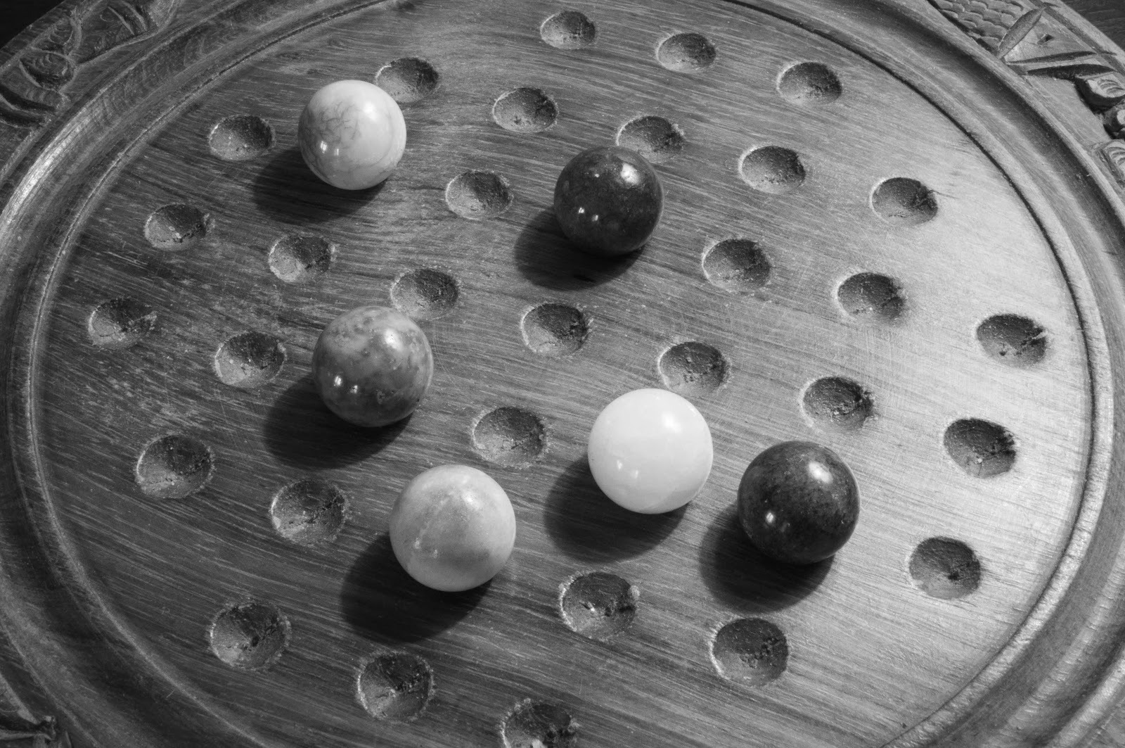
With the last placement I wanted to avoid extending either of the lines - it would have looked contrived otherwise.

35mm, 2 secs, f/25, ISO 400
It wasn't until I overlaid the final image with lines did I understand how difficult it is to truly fit the brief. Triangles are such a powerful and recognisable shape and there are 3 of them of a similar size in the final shot. In hindsight choosing a solitaire board, with its regular pattern, makes it more difficult for an arrangement to feel random - and each point is uniform too.

The more I look at the final image, it's not the triangles I see - it's the diamond shape that occupies the centre.

In summary, I didn't make things easy for myself but I do feel that I have managed to avoid the rather easy pitfall of the image appearing obvious/contrived.

Exercise sixteen: The relationship between points

A single point depicts simplicity, yet that is lost once a second point is introduced to the frame.  The brief for this exercise was to capture 3 images containing 2 points. 

50mm, 1/160 secs, f/1.8, ISO 400
The dominant point is clearly the coffee mug for several reasons regardless of their similarity in size: the narrow depth of field renders tithe only thing in focus; it's brighter than anything else in the frame, and it conveys a message which compels the viewer to read.

50mm, 1/60 secs, f/1.8, ISO 800
You may have noticed the current obsession with my 50mm lens. Similar to the first shot, only one of the points in this image is in focus, yet the other child's shoe creates dynamic tension as it competes for the viewers attention because of it's irregular, more interesting position. The entire scene gives a sense of missing out on the fun that's happening elsewhere.

[Additional image and conclusion to follow]

Exercise fifteen: Positioning a point

The weather has been suspect to say the least so I've had little choice but to shoot for the following couple of exercises indoors.  The brief for this one was to capture 3 images containing a single point and compare and contrast them with the single point images previously identified.

50mm, 1/125 secs, f/1.8, ISO 400
This toy car dominates the frame far more than I expected, and even more so with the reflection. So instead of realising my intent to potion the subject on the upper left intersection of the rule of thirds, the eye (courtesy of the area in focus and its brightness) is drawn to the front wheel. Hence why I've drawn the red intersection through it.

I positioned it above the horizon to emphasise the reflection and to the left in order to imply movement into the frame. (See the images in the previous post of the fish and the rabbit.) The angle of the subject further accentuates this.

50mm, 1/60 secs, f/1.8, ISO 800
Upon conversion to black and white the illuminated Apple logo become the single point in this image. The rationale for positioning it lower right was for the subject to benefit form the natural light from the upper left. The upper left of the laptop, arrow-like in appearance, implies movement towards this light. (The bird of prey, small child and cider bottle images have similar qualities.)

50mm, 1/50 secs, f/1.8, ISO 400
Composition is restricted with this subject. Any closer and the eye dominates the frame and is no longer a point; any further to the left of the frame then a second point would be introduced (the other eye!).  The decision then rests with where to position the point on the vertical.  The upper part of the frame gives a greater sense of authority, amplified by the slight incline of the camera.

I must admit to thinking that this exercise was a mere repetition of the early exercise but I've noticed a growing sophistication, not only in my critique of images but my growing ability to to compose and capture them.

Pages